In what ways does your media product use, develop or challenge forms and conventions of real media products?
Before starting this project, I had limited knowledge of the Film Noir genre. I knew the basic facts, (black and white film, 1940's era, detective based storyline) but nothing about the codes and conventions or examples of any famous examples of Film Noir. As a group, we started off by sharing the information we knew about Film Noir. Several members of the group had already studied the genre in a different subject and this prior knowledge proved to be a great help when planning our film to replicate a genuine Film Noir.
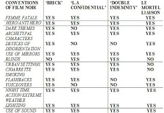
To get an idea of the codes and conventions displayed within Film Noirs, we watched several famous examples of the genre. These included 'L.A Confidential', 'Double Indemnity' and 'Brick.' We then made up a table and compared all these films to see if they all contained the most common codes and conventions of real life Film Noirs. I have added an extra column that contains our own film and compared it alongside the genuine Film Noirs to see how it compares.
Another way we used conventions of Film Noir was in the costumes our actors wore. As shown in the character profiles, we dressed the actors in suitable clothing for the time period most Film Noirs were based in. In the 1940's - 1950's, the time when most Film Noirs were set, most men dressed smartly, in suits, shirts and ties - something we picked up on and used heavily in our film. The girls also dressed smartly in skirts and blouses and we made sure every female in our film followed this rule, the exception being the Femme Fatale who we dressed in a black dress to represent her corrupt side and also give our film a unique twist on the genre's costume codes whilst still dressed smartly to follow the codes and conventions of a regular Noir.
There was no doubt in our minds that we were going to make our film in black and white due to the fact that this is probably the main characteristic of the Film Noir genre. We had the option to go down the route of a Neo Noir film, an example being 'Brick' which was filmed in colour, but we felt that we could achieve the best mark by following every single convention possible to replicate a genuine Film Noir. Another reason for choosing to shoot the film in black and white was that this allowed our film to convey more atmosphere to the audience.

There was no doubt in our minds that we were going to make our film in black and white due to the fact that this is probably the main characteristic of the Film Noir genre. We had the option to go down the route of a Neo Noir film, an example being 'Brick' which was filmed in colour, but we felt that we could achieve the best mark by following every single convention possible to replicate a genuine Film Noir. Another reason for choosing to shoot the film in black and white was that this allowed our film to convey more atmosphere to the audience.

For example in the opening sequence, the contrast between the hall light and the black and white filter gives off an eerie effect that is used as a metaphor for the chilling message our film gives across.
How effective is the combination of your main product and ancillary texts?
I strived to continue the trend of including as many codes and conventions of Film Noir into my ancillary texts. The main focus of this went into my poster, as this is the main follow up product to the film itself. One of the main conventions of a Film Noir poster was to include a female femme fatale as the main feature. This is used to show that male gaze theory was involved heavily within Film Noir. I have used this convention in the design of my own poster in order to make it as authentic as possible. The photo I chose also features Emilie looking straight into the camera, which makes the audience feel that they are being addressed directly by the poster, creating a strong connection between them and the characters in the film. It also suggests that the Femme Fatale is the main controlling character, as she is in the middle of Frisco and Goodwin's fight for her love. Another convention of Film Noir posters is the colours that are used on the posters. Commonly, Black, White and Red are the three staple colours used as these three colours represent passion, lust, danger and romance. All of these are themes within Film Noir, and I used these effectively to construct a realistic Film Noir style poster.
One afternoon we gathered in a classroom in school and showed our Film Noir to an audience of media studies students. Everyone was given a post-it note and asked if they could write down some feedback after viewing the film. (See 'audience feedback'.) I then took this feedback and analysed it to give myself a better look at what areas our film excelled in and what we could have done to improve it.
It is clear to see that our film had a good reaction which pleased us greatly. It was satisfying to see that all our hard work had paid off with the end product.
Areas that our audience enjoyed included; Camera shots, lighting and sound effects, whilst areas we could have improved on involved the acting skills and a slightly clearer story line. We weighed up the pro's and cons of changing these factors to improve our film but concluded that it would be impossible to undertake as it would mean finding new actors and re-filming the whole film all over again. Also, this was a minority opinion and the majority of the audience had no quarrels with the acting or storyline.
Technology we used in the process of planning/filming our Film Noir, Le Mortel Liaison:
- Microsoft Word
- YouTube
- Adobe Photoshop
- Photography studio/lighting
- Canon 500d camera
- Sony Vegas editing software
- Alienware laptop
- iTunes
- Windows Media Player
Microsoft Word: This played a huge part of our pre-planning and production. We used this program to type out all our scripts, actors directions, lighting notes and sound effect placements. We had to know how to use all the different program features, from paragraphing tools, table inserts and highlighting tools to Word Art and diagram inserts. I also used Microsoft Word to type out my film review as this was the most practical program to do this in.
YouTube: We used this video hosting site to upload our film to for viewing on our blogs and to make it easier to send the film to people to get their feedback.
Adobe Photoshop/Photography Studio/Canon 500d Camera: This program is what I used to edit all my photos and posters in. The simple reason being that it is the easiest program in which to do so. However, at first I found the program quite hard to use and it took me a lot of practice before I was able to produce pleasing results which were good enough to be used as final products. All the photos in the character profiles I edited in Photoshop, using black and white and contrasting filters to achieve the desired effects. The photography studio was operated with the assistance of my group, all of whom study photography and had a good knowledge of how to use the lights. Here we achieved effective shadow work which added to the Film Noir effect. The Canon 500d camera belonged to Matt, although we all took turns at using it for the filming with the assistance of a tripod to avoid shaking footage.
Sony Vegas Editing Software/ Alienware laptop: This is the software we used to edit our film. We chose to do this in our own time out of school using the laptop because it was a step up from the equipment available at school. Sony Vegas is a very powerful program that is used by many leading editors to produce stunning results. Seeing as we had it available to us, it was our natural choice of editing software. For example, we could edit the black and white contrast of our entire film in one go by selecting all the film clips using the 'CTRL' 'C' combination and then selecting the contrasting level in the edit bar. By sliding this up and down, it would instantly render the film the shade of black and white we wanted. Another example of this software working to our advantage was when we realised that our film was several minutes too long to be submitted. We were faced with the problem of cropping certain bits out to shorten the whole thing. Sony Vegas made it easy to shift out film over the deleted clips without going out of sync, resulting in us having to carefully align all our sound effects, dialogue and video clips all over again, wasting valuable editing time. The only downside to this software was how long it took to render the finished film; a wait time of around 25 minutes for just a 6 minute long film. However this was quickly evened out by the fact that this program gave us a high quality finished product.
iTunes: We used this program to store, sort and play all our sound effects and background music. The highly organised filing system this program provided us with was ideal for keeping track of where our music was. We could even have our sounds stored in the order that they were used in the film to make things easier for us.
Windows Media Player: We used this media playback software to present our film to our audience. This is the default software on most computers and so was our natural choice.

No comments:
Post a Comment